What they wanted
From the other side of the world, Australian-based start up company The Sanctuary Olive Oil Co. invited KidDotCo to come up with an edgy brand for their fledgling olive oil company. They also wanted us to design product labels and promotional material. This project was certainly right up our street!
What we did
- Brand Development
- Corporate Guidelines
- Packaging Design
- Social Media Marketing
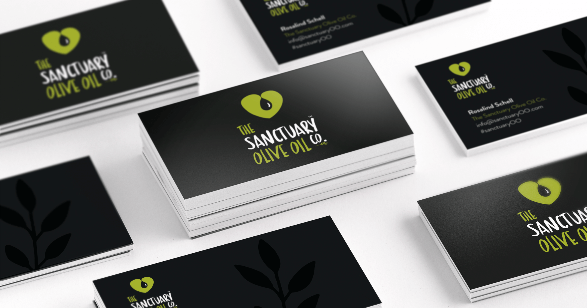
- Stationery Design

Drizzle a little love on your salad
The Sanctuary Olive Oil Co. meant quite a lot of different things to us and working from a blank canvas meant we were in charge of how the brand looks from the launch. These kinds of jobs excite us because it allows us to liaise with a client and guage exactly what she needed, we actually find it quite rewarding listening to what they want and then throwing all kinds of ideas to the wall in a brainstorming session. We think this is important as it gets our creative juices flowing.
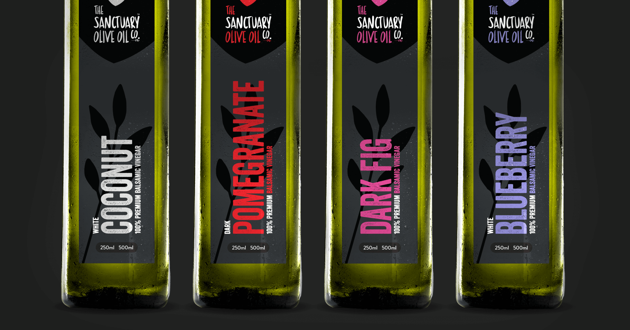
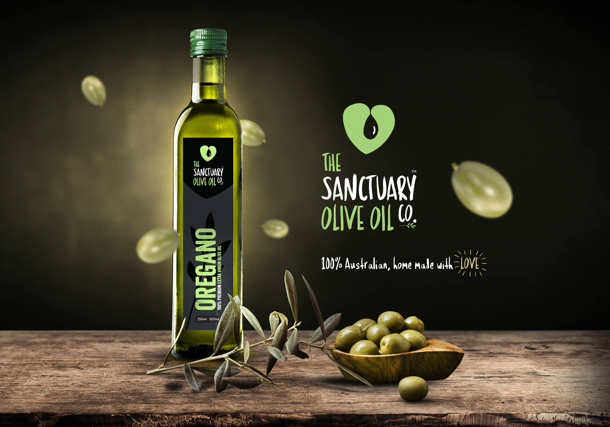
Following some productive meetings we pitched heart idea concept to her. While hearts in design can be problematic, we feel the execution of this including a clever use of negative space provided a unique shape perfectly represented her business. In our experience, the use of black in branding food has commonly been associated with a more higher-end product. This is why we chose black and dark grey as the base for her brand. Her olive oil and balsamic vinegars are a premium product that are found on Farmer’s markets and such like. We had discussed that there would quite a variery of flavors in this range so it was important to include a complementary colour scheme which represented each flavor. For example, we chose lilac for the blueberry and a rich red for the pomegranite.
Heart your olive oil!
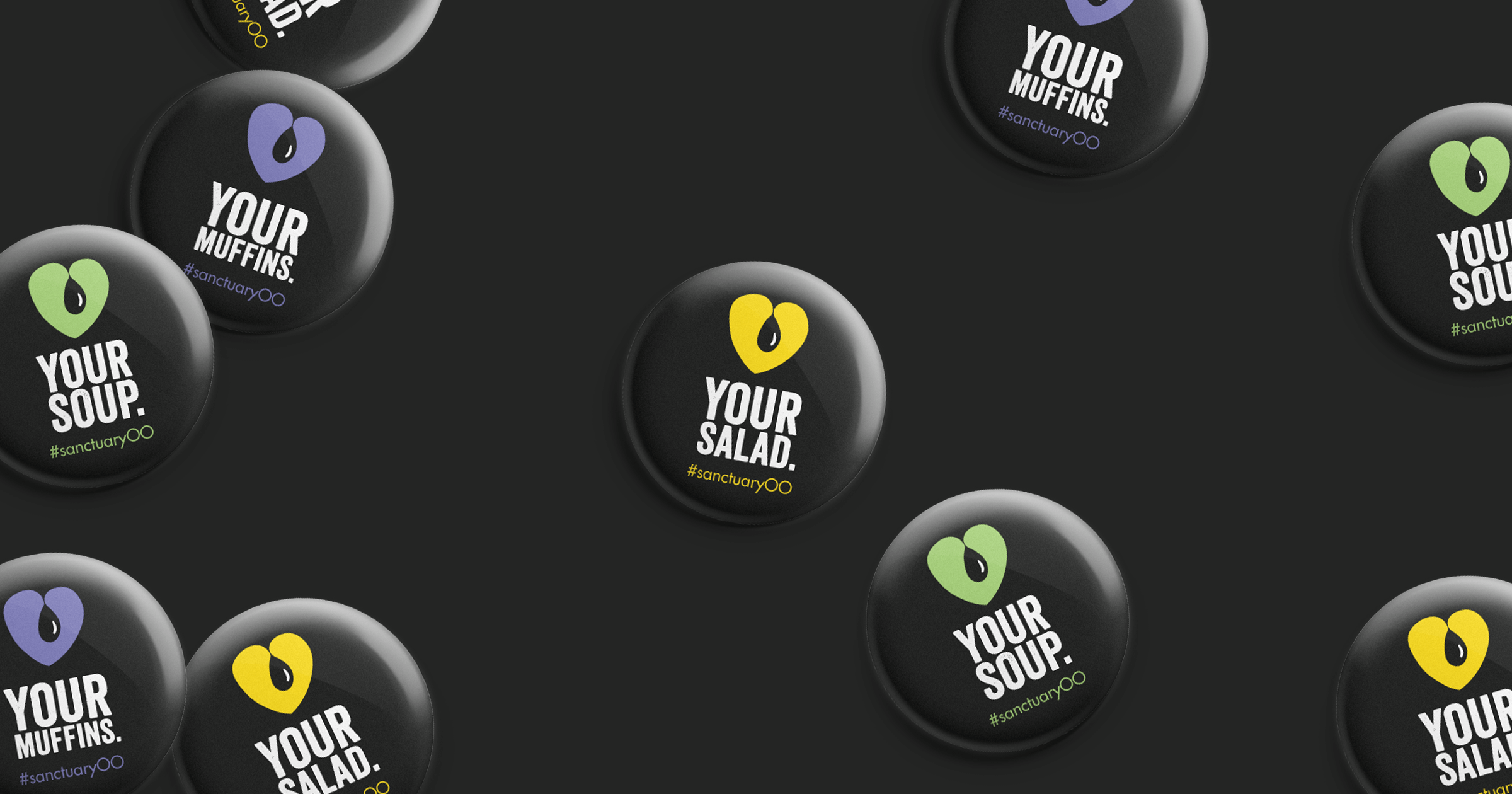
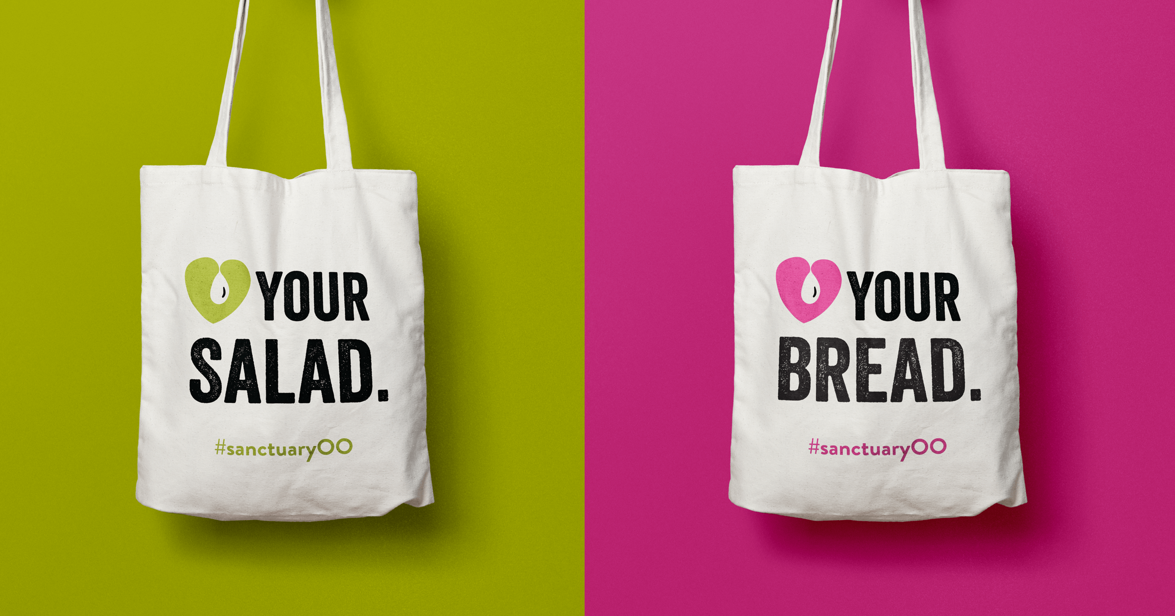
In addition, we pitched a little marketing campaign to launch their brand, creating a slogan ‘Love (heart) your salad’, ‘Love (heart) your bread’ and ‘Love (heart) your soup’ which they used in their marketing material, both online, through social media and also featured on the labels of their products. This all tied in to the brand nicely, we feel.
We are genuinely proud to be associated with this brand watching it grow from strength to strength.
