What they wanted
Accent Events – experts in premium wedding planning in Italy – invited KidDotCo to raise their profile online. Owner Gio Daye is and incredibly passionate about her work and has over ten years experience in wedding planning. She has always been and active blogger and in the right circles, she just felt her brand wasn’t as strong as it could be especially being in an industry where first impressions really do count. She asked KidDotCo to work from blank canvas in giving her a brand and online presence that would set her apart from other companies in such a competitive marketplace.
What we did
- Brand Development
- Corporate Guidelines
- Frontend Development (HTML5/CSS)
- Search Engine Optimisation (SEO)
- Social Media Marketing
- Social Media Optimization (SMO)
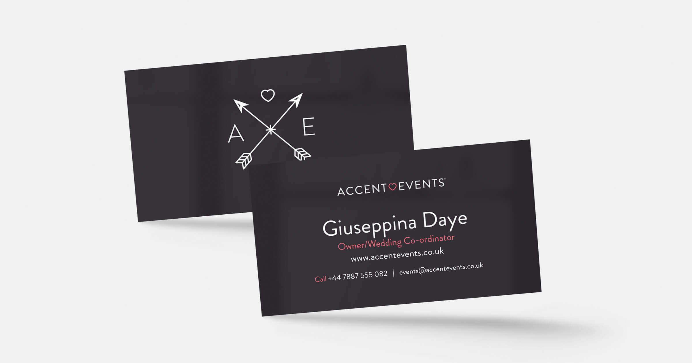
- Stationery Design
- UX/UI Design
- WordPress Integration

Fairytale weddings really do begin with Accent Events
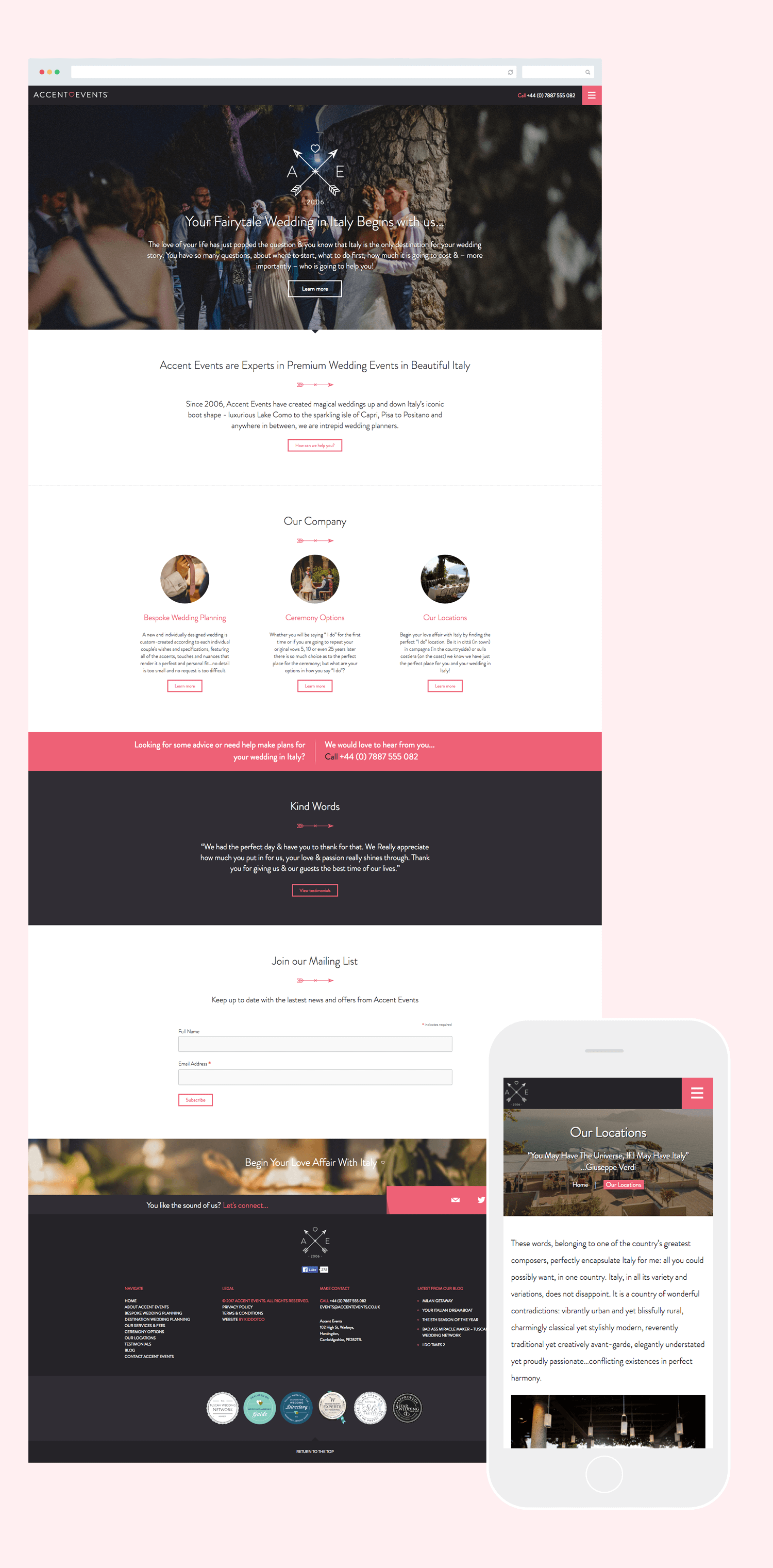
Since we had a blank canvas, we were able to craft a brand which set her company apart from her competitors. Her previous brand felt tired, clinical and importantly felt too similar to many of the other companies out there. The design process included the development of a truly unique colour palette, a classy brand that included a wordmark and icon, and the design and development of a responsive website with the new brand. Additionally, we created some social media elements to increase exposure online as well as downloadable pdfs which were used to email out to potential customers and wedding bloggers.
We realised from the offset how good Gio was at her job – she was with real deal. She lives it, she breathes it and she does it all to a very high standard. It was our job to make sure the brand complemented her work ethic delivering a premium product from initial concept to final delivery.
To explain the thought process behind the icon we created – two crossing arrows, a heart and initials of Accent Events – was born out of two lovers engraving their initials in a tree trunk, a traditional past time for people declaring their love. A gentle nod in the direction of true romance. We also included the date 2006 when Gio began her business as you can never underestimate the value of someone experience and this is something Gio has in abundance. While we felt the icon was strong enough to work on its own, we also created a word mark that would work on its own too.
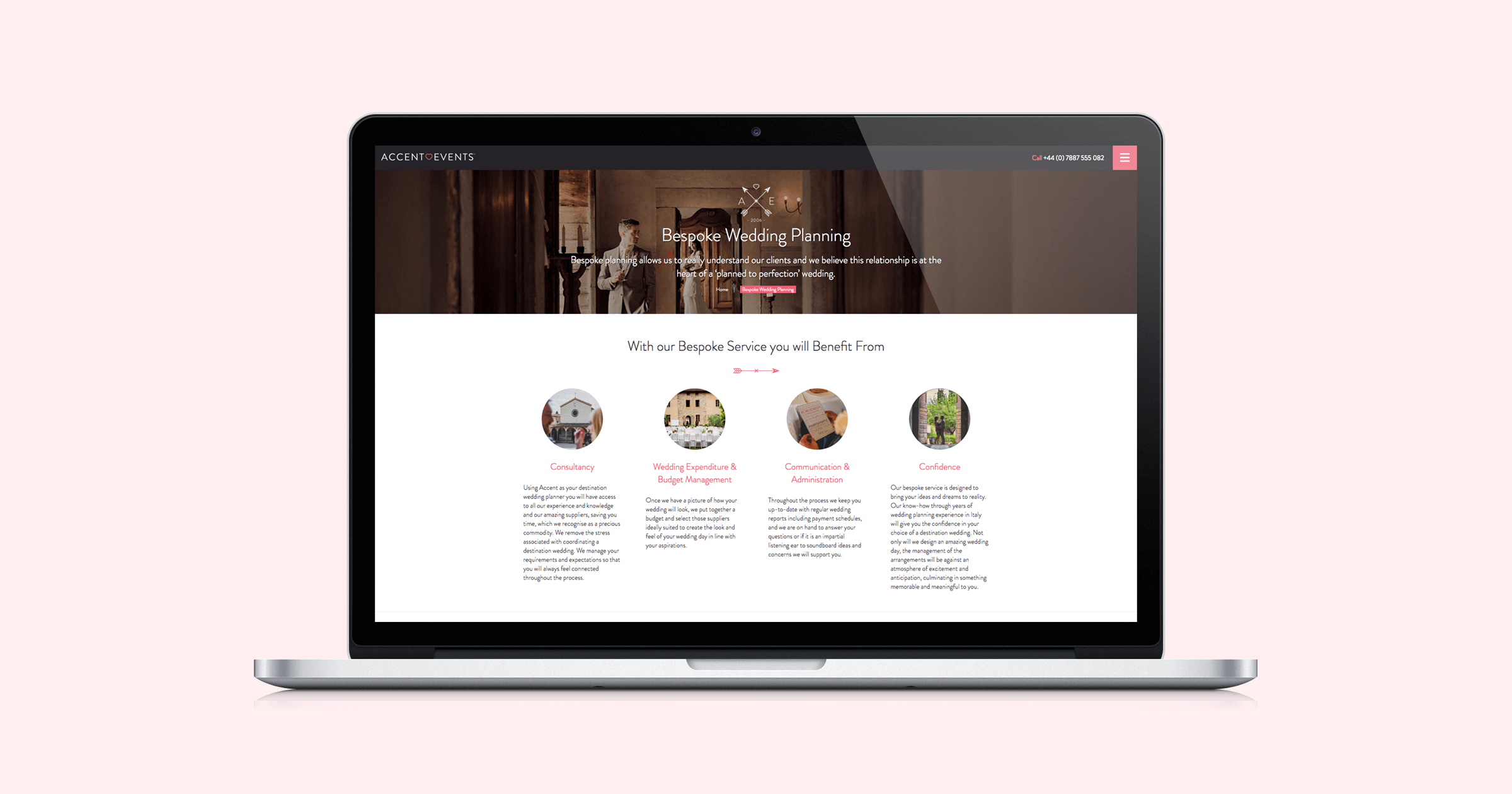
With the website, we made extra efforts to move away from a template feel and created an informative bespoke user interface for potential clients to browse and gain an insight in to Gio’s work. Built on WordPress, we have given her as much access as possible so she is in control of keeping the site updated. We also gave her some comprehensive lessons on getting the best out of her blog posts when sharing online and the importance of structuring SMO tags correctly.
We are extremely proud of the outcome of this project and one she is proud of too!
