What they wanted
Having worked with Amy with the creation of her original startup, she was keen to get KidDotCo involved with her re-brand. Returning to work from maternity leave, a change of premises and a slight shift in the direction of her company meant she was looking for something more suited to what services she offered. Naturally, we were more than happy to be involved.
What we did
- Brand Development
- Character Design
- Corporate Guidelines
- Frontend Development (HTML5/CSS)
- Social Media Marketing
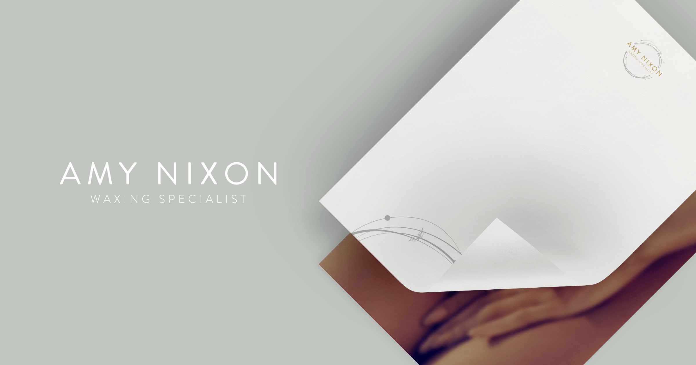
- Stationery Design
- UX/UI Design

A brand new treatment room deserves a brand new look
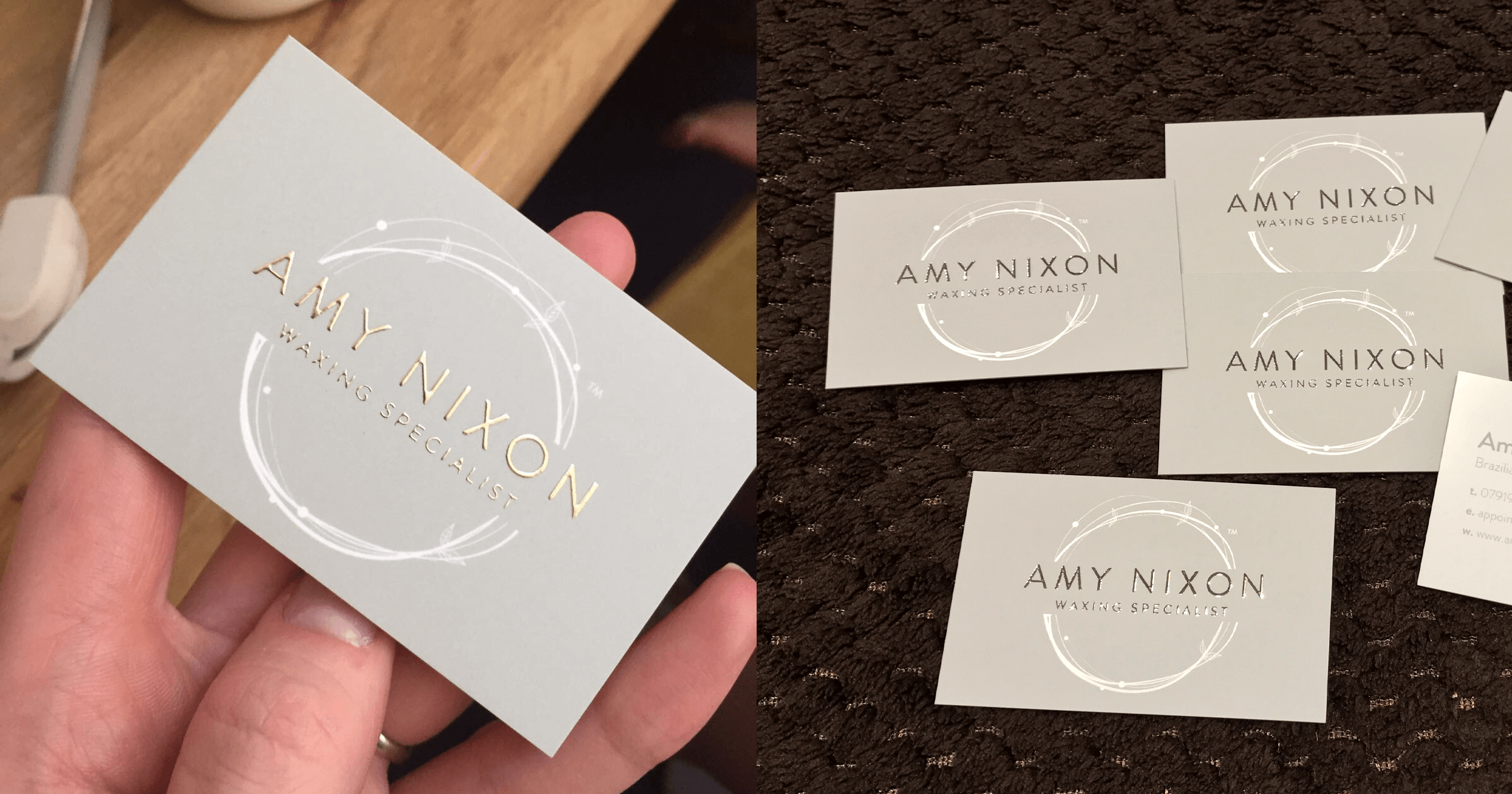
Amy a reputation as one of the leading full body & intimate waxing specialists in the area, so it was important that she had a brand which represented her high-quality work. She was keen for us to experiment with foil printing and offered us an insight to a colour scheme she was keen for us to explore.
Our initial thought process was to create a delicate circular shape similar to a laurel leaf formation. While it represented all things natural, we felt the shape looked strong and framed her name effectively. When applying the gold leaf print to her business cards the laurel shape – while still impactful – almost looks secondary to her gold name, which is exactly how we envisioned it.
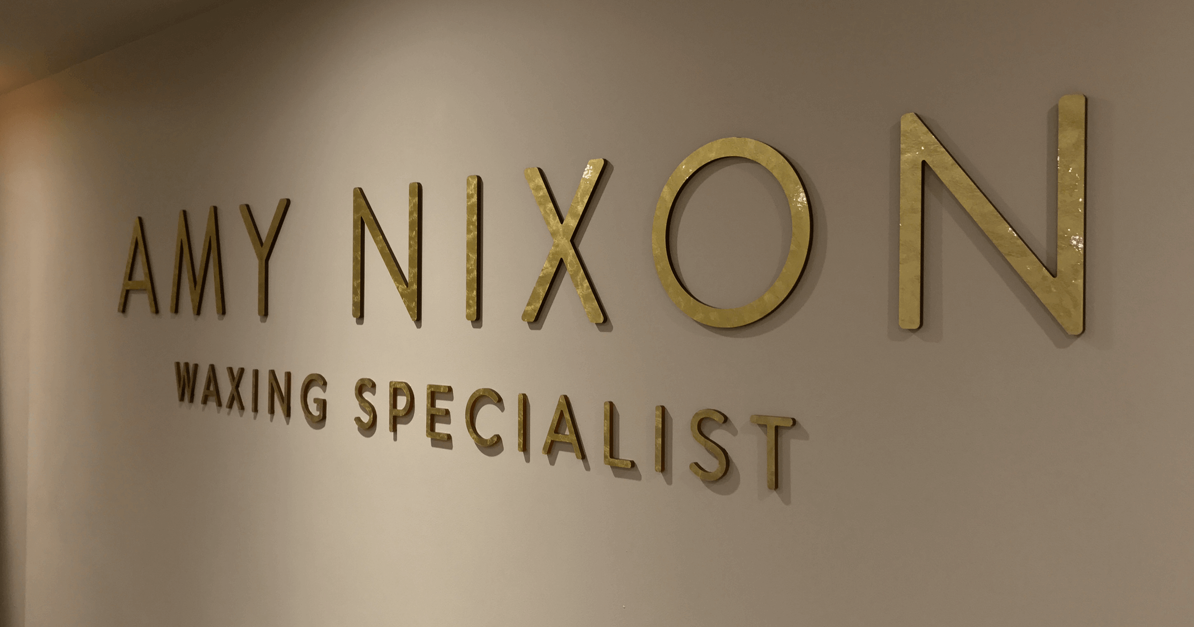
The pale duck egg grey provides a perfect base for the white laurel shape and gold leaf type to pop. Her treatment room also has her branding weaved throughout and we are really pleased with the end product.
